The Challenge
Who is the client?5km run organises a free park run in Sofia and other major cities in Bulgaria. They have only one paid event – the XL runs. They are one of the major ways in which the organisation sustains itself financially.
What’s the problem?Currently there are not as many sign ups for the XL events as the client would like to see. The sign up process that happens through the site is complicated and possibly turning people away.
What’s my goal?Increase conversions for XL run sign-ups by improving the sign up journey.
The Process
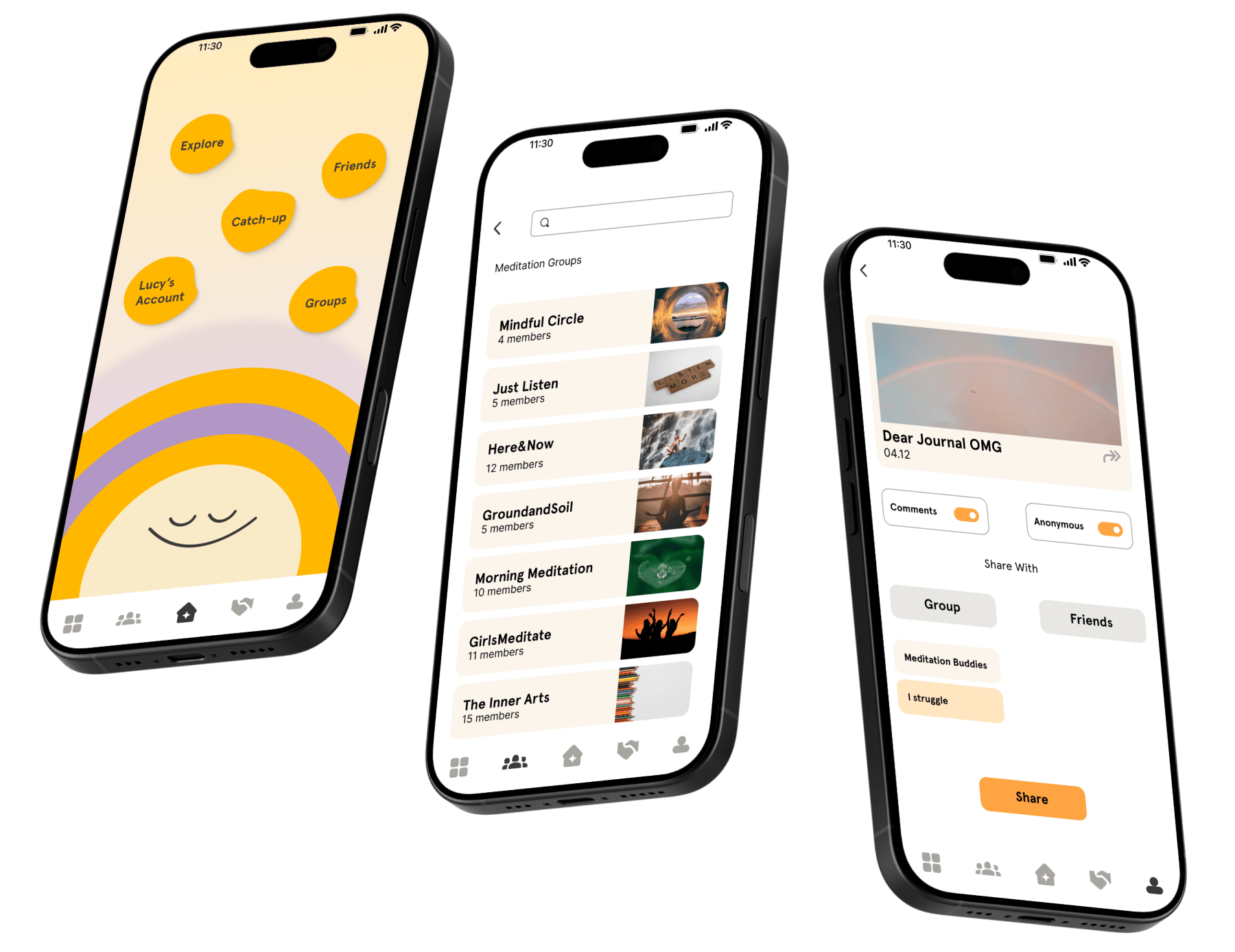
Our team of three adopted a rotating leadership model, conducting 15 user interviews with mindfulness enthusiasts and teachers. We prioritised features using the MoSCoW method and ideated with HMW statements and Crazy 8s.
Key innovations:
- Animal avatars for anonymity and playfulness.
- Choice-based homepage to reduce overwhelm.
- Group questionnaires for curated community spaces.
- Anonymous toggle for sharing to ensure privacy.
After creating user flows and wireframes, we conducted usability testing, ultimately designing the social feature as a standalone app to preserve its distinct purpose.
The Solution
We delivered a high-fidelity prototype that demonstrates how social features can enhance mindfulness practice without compromising user wellbeing.
Key learnings:
- Social connection and mental health protection can coexist through intentional design.
- Rotating leadership strengthened collaboration and team dynamics.
- Simplifying digital experiences reduces toxicity and benefits users.
The concept addresses a critical gap in digital wellness by prioritising psychological safety, authentic sharing, and user control.
Previous
Park Run Sign-up
Client
Team
Web Redesign
Crafted a new sign-up flow. Restructured the site informational architecture.
57%
Increase of SUS score with final result of 97.1%
View
Next
Boardgame Business
Concept
Solo
Desktop Web Redesign
E-commerce re-design. Landing page, product listing and description page. Check out flow.
15
Usability Tests
View