The Challenge
BoardgamesBG, a small family business in Sofia, Bulgaria, needed their e-commerce website redesigned. First impressions revealed poor visibility and readability, creating friction for users trying to browse and purchase board games.
Goal:
Improve the overall shopping experience by addressing usability concerns while maintaining the brand's identity for desktop users.
The Process
I conducted a heuristic evaluation, competitor analysis, 10 user interviews and 8 usability tests. Findings showed that 80% prefer shopping on laptops, guiding a desktop-first approach.
Key design decisions:
• Created the persona to represent users with the greatest usability challenges.
• Card sorting showed a need for full terminology over abbreviations.
• User journey mapping identified navigation and product discovery pain points.
• Iterated from lo-fi to hi-fi prototypes with continuous user testing.
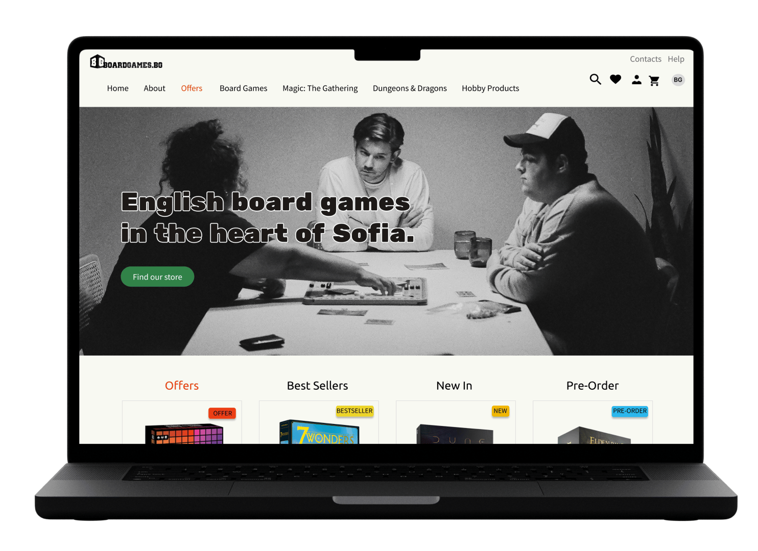
• Designed landing, product listing, product detail, and checkout pages with improved filtering, clear hierarchy, and streamlined flows.
The Solution
Delivered a hi-fi clickable prototype that transformed the shopping experience through improved information architecture and usability. The redesign addressed all critical pain points while maintaining a playful, minimal aesthetic.
Key learnings:
- Clarity and simplicity over cleverness - full terminology and filters aligned with industry standards improved accessibility for casual players.
- Iterative testing with target users prevented assumptions and validated solutions.
- A strong brand identity can be communicated through design - I made the site’s unique focus on English-language games immediately clear in the hero section.